


Think visual (updated)
Use your dirty mind and some tools
It’s not only the men who think visually; we all do.
In content production, the visual is the most underestimated element. Not talking about social here; talking about written content. Your blogs for SEO, employer branding on the careers www, newsletters, editorial stuff like that.
The usual worn-out process:
- First, we write, edit and approve the copy.
- Second, we think about the visual. With a dive into the worn-out boring stock database, we pick out some visual that will do.
- Third, we hit ‘publish’ or ‘send.’
Wrong. Read below how to do it differently to stand out.
And yes, sex still sells.
Why it matters
The visual is the carrier of the message. Not only on social, also on www, .careers, blogs, newsletters, and other editorial content. We look at the picture first, and then we decide whether to read it or not.
Most content producers still think of copy first and visual second. My point is to treat both equally. Or, if you dare, even go visual first and copy second.
How to get your visual?
There are a few easy steps to follow.
1. Ideation
Find the visual. N=1, I think about the visual even before writing the title and body copy.
I already have a picture in my mind that enhances the story I want to tell.
You need to have a bit of a bold and dirty mind for creativity in the search. If you stick to the obvious, you’ll get obvious and boring usual.
My go-to sources for copyright-free visuals are Pexels.com and Unsplash.com. A complete overview of 16 free-to-use stock websites.
- I use one or more keywords of my content piece for the search
- If I don’t find what I’m looking for, I use synonyms for that keyword
- If I find something I kind of like, I browse more work by the same photographer
- If I find something I really like, I download it and start playing with the visual
Sometimes I feel like an old-school film director by imaginary cropping the visual with my hands.
2. Adjust colors
This step is indispensable to pop the visual. Make it stand out and be eye-catching. Honestly, all visuals I use are edited, also the black-and-white ones.
The first visual is the original, as I downloaded it from Pexels, and the second is my edit, credits.
Play with the lighting, shadows, and saturation; make it your own and match your brand's voice. You can use preset filters or DIY.
Just have fun, fool around, don't be afraid, and you'll find something you'll like.

3. Crop and zoom
Here’s the magic. Can you work with the visual for all channels? A blog header usual is something horizontal; social prefers vertical or square.
Play with it. Zoom in or zoom out. Dare to flip, to twist and turn, or to go really into detail.
This is where my mind trick with imaginary cropping, mentioned in the first step, comes in. If you’ve done this a few times, you’ll get an eye for this.
The formats I need
- www header visual, horizontal preset
- LinkedIn header visual 1280 x 720, I go .gif for some animation
- 1:1 Square for social and www thumbnail
- 9:16 Vertical for social
This mind trick works for every visual. Whether the original is landscape or portrait, I know that I can create awesome assets.
The most difficult one is the horizontal, if I find that one, I can make it work for square and vertical as well. Below is another example, from the original visual to the cropped assets.
Beauty is in the eye of the beholder. So is creativity.


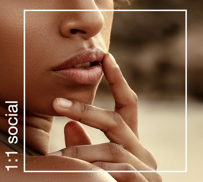

Dirty mind and sex sells
If you want to stand out, you have to dare to be different. As the old saying goes, ‘sex sells,’ and I prefer this kind of images myself; I choose the sexier stuff. Boudoir breathing sexiness. You can almost feel the excitement, the tension of something fun that’s going to happen.
I also go for something edgy. A bit rough and raw. Different, unlike others.
You do you, me do me.
There’s no golden rule, except for the rule of thumb: choose a style that fits your (brand) personality and that you like. That makes it a lot easier to find the right visual.
Oh, yeah, don't forget to be diverse and inclusive in your images. The world isn't made of only white tattoo-free Joneses. And honestly, there are so many amazing photos of people of color – that can't be an excuse anymore.
Tools I use
Everyone has their preference for the tools to use. Even though I can work in Photoshop, I used to prefer to work in Keynote (I know…), and now it's everything in Canva Pro.
Why did I use Keynote? I had my templates set up for the horizontal and square formats, including the text layer, to give credit to the photographer. As Keynote is user-friendly, it’s fast and easy to zoom, adjust colors and copy-paste the edited visual from one template to the next.
As it's all digital, there's no need for a high-resolution visual; a screen dump of the keynote slide will do. I do realize this all sounds pretty amateurish, yet it has done the job for many years, so why not?
If I need some more complicated, advanced adjustments, or high res, I jump to Photoshop.
However, recently I changed my mind. Now everything is in Canva Pro.
Using Canva (updated)
I've been quite reluctant to use Canva, except for the usual social assets. I got my templates, and I can create the visuals for LinkedIn and social in minutes. It almost takes longer to download everything than to create it.
The pro version is worth the investment as it has more features. If you’re just starting, the freebee version will do perfectly.
While I'm playing around with the tool, discovering the features via tutorials in IG and TikTok, I'm tapping into its real potential.
I'm a novice and just dipping my toe into the tool, yet I'm already fully on board, and I ditched using Keynote now.
Why?
- Creating templates for speeding visual assets for socials has never been easier and faster
- Setting up templates for visuals for the header (19:6) and square (1:1) for my newsroom
- Using the edited visuals for my newsroom for the social templates with just one click and go
- Love love love the rule of thirds gridlines that are baked in by default
- Great feature for mockup. Before, I manually created an iPhone screen dump in an iPhone frame. Now Canva does it for me (Pro version only)
- Amazing feature to fool around with visuals in letters once you know the trick. Saves me so much time in Photoshop
- Keeping my desktop clean as I do everything in Canva instead of saving visuals on my desktop and uploading them to another tool. One stop go.

My advice, use your dirty mind to get some sexiness in your visuals. Sex still sells. Boring, average stock doesn't.

Final words
Think visual. Use your dirty mind and imagination to discover the right visual. Two things that matter; use copyright-free images and always give credit. Oh, the third thing that matters is to have fun.
The last piece of advice, build your own database with visuals you like, so you always have a backup if your search stays unfruitful.
Don't rule out IG and TikTok for some great free tutorials on Canva. All the tips and tricks fool and dummy-proof explained. My current favorite two:
Want to know more, some details, tips, or tricks? Want to get started? I'm here to help; drop me a DM and we can have a quick chat.
Some more examples of the power of Canva
When you follow the tutorials, play, and fool around a bit, Canva with its AI and ease of use, is actually a pretty decent replacement for Photoshop (on an amateur level like me and most content producers).
You can export in an animated gif, to upload some animation when you can't use a video file.

Or you can download the png's for socials.


 Powered By PressPage