

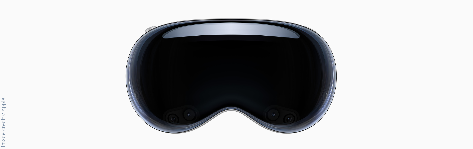
Is iPhone iOS 26 quietly preparing us for the spatial computing Apple Vision Pro era?
Three subtle design shifts in the iOS 26 update that are a hint
Apple has a habit of teaching us new behaviors long before we realize it. They did it when they removed the home button and when Face ID became the default way to unlock, pay, and confirm.
And now, while testing the public beta of iOS 26, 3 design changes stand out that make me wonder:
→ Is iOS 26 quietly training us for Apple Vision Pro and the era of spatial computing?
The conclusion might already be here: these changes aren’t just aesthetic tweaks. They feel like subtle prep, nudging us to see screens as portals, not panels.
1. Liquid glass design
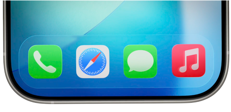
The first thing you notice is the interface itself. iOS 26 introduces a liquid glass effect across navigation layers, a transparent surface that lets background elements bleed through. It’s more than a visual refresh.
→ It creates the sense that the interface is floating above the content instead of sitting on top of it
That spatial feeling is also noticeable in the subtle, playful animation when unlocking the screen. The widgets float and bounce into their places, as if they’re settling into a three-dimensional scene instead of a flat layout. See the video at the bottom of this page.
This matters because spatial computing depends on depth. The Vision Pro interface isn’t built on static windows but on layers that occupy space. Transparent, glass-like surfaces are a way of signaling that shift. They train your eyes and your brain to interact with elements that are part of a scene, not just stuck to a screen.
It’s subtle, but Apple has always used design language to shift user behavior. The skeuomorphic era taught us to trust digital objects. Flat design taught us to read function from minimal cues. Now, liquid glass hints at a future where screens are no longer hard edges but soft frames into something larger.
2. A more immersive full-screen experience
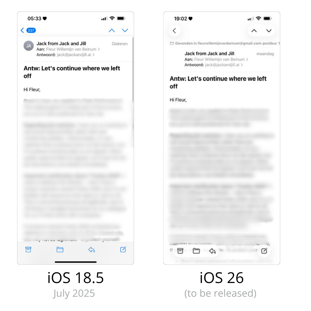
The second change is easy to miss until you use it. The top and the bottom navigation bars aren’t gone, but they’re no longer the solid white strip we’ve seen for years.
In iOS 26, it becomes a transparent glass bar that lets the background continue underneath. It’s shorter, lighter, and it floats instead of anchoring the UI with a hard line. That one shift makes the entire screen feel more immersive.
→ It’s not about removing elements; it’s about erasing the sense of edges, and it feels spatial
The phone starts to feel less like a device and more like a window, an opening into content instead of a container for it. That’s exactly what Apple is creating with Vision Pro: the screen as a lens into space, not a frame that defines it.
By changing such a small detail, Apple is teaching us to interact without relying on heavy visual anchors. That behavior will translate perfectly when content is no longer locked to a rectangular device but layered around you.
3. Spatial photos
The third change feels playful on the surface. Photos in iOS 26 now have a subtle 3D effect, giving depth to images as you move your phone. It’s not entirely new technology; Facebook experimented with 3D photos as early as 2019, but Apple’s implementation is different. It’s baked into the OS, not a feature inside an app.
→ And it feels natural, like the ‘living pictures’ straight out of Harry Potter.
What’s interesting is not the novelty but the context. By bringing 3D to the camera roll itself, Apple is normalizing depth as part of everyday content. They’re making spatial elements something you expect, not a bonus feature. When you later view those same photos in spatial computing, on Vision Pro, and see them layered in space, it won’t feel like a leap. It will feel obvious, inevitable.
This is how Apple prepares us: small, integrated steps that slowly rewire what ‘normal’ looks like.
Connecting the dots
Individually, these changes could be dismissed as design polish. Together, they form a pattern.
Apple has done this before. Removing the home button trained us for gesture-based navigation. Face ID prepared us for a device that knows you by presence, not touch. Each of these shifts seemed minor until they became foundational to the next platform.
iOS 26 feels like the same playbook.
The liquid glass design, the edge-dissolving navigation, the everyday 3D effects, they’re not about making iPhones prettier. They’re about reshaping how we interact with digital content so that when screens dissolve into space, it feels natural. We’ll have already learned the language.
The bigger picture
Spatial computing isn’t just a hardware leap. It’s a behavioral one. You don’t wake up one day and suddenly stop thinking of screens as boundaries. You get there through small, consistent nudges. Apple has always understood that. iOS 26 might be another nudge.
If that’s true, this update is a preview of a future where devices disappear and content surrounds us. And just like every other time, Apple is teaching us the new rules before we even realize we’re learning.
→ Am I wrong and seeing things that aren’t there, or is this Apple’s subtle hint? What do you think?
Image credits: Apple and my own content on iPhone with iOS 26
This unlock screen animation is preparing us for a spatial, layered reality with animations that feel alive and playful. The first part is in real-time, while the second is in slow motion to show the ingenious beauty of the animation.
Stay ahead on marketing, content, and AI with insights that actually matter
My weekly LinkedIn newsletter is a two-click free subscription, and you can unsubscribe at any time. No hard feelings.
Simple as that.
 Powered By PressPage