


To improve your content, apply 'visual hierarchy' to your content calendar
Make the visual the most important, and review the mock-ups instead of copy only
I'm wondering why we're still trapped in the same old patterns. Stuck in the way we've always done things, especially with a content calendar.
It's about time to shift from copy-centric to visual-centric in the content review processes!
Back in the 2000s, we reviewed the copy first and the visual second. Nowadays the visual is the eyecatcher and drives engagement.
My kind advice to everyone who reviews and signs off on content, you focus too much on the copy, and too little on the visual.
Current state of content calendar and approval processes
Over the last years, I've seen quite some content calendars. What strikes me the most is the importance and focus on the copy.
You, as a senior manager, review the text and the visual is, at best, hidden in a link or a thumbnail, and you trust the team to nail it. Why? You're missing half of your content by doing so.
I'm not saying you should be an annoying micro-manager; I'm saying you should review and sign off on the final product, the mock-up created with visual or video screen dumps and copy, not copy only.
The easiest way to do that is to put the visual central in the content calendar and copy second.
Visuals should lead the way
My advice is based on the visual hierarchy theory, perfectly captured in the visual below.

For social content
For social content, this works exactly the same → there is a visual hierarchy.
You see the visual first, the caption second, and if you’re really interested, you’ll click on ‘read more’ to read the extended copy. This is more evident on Instagram. However, this also applies to LinkedIn.

2x copy: a short caption and the extended copy
Good to keep in mind, you need 2x the copy. First, the short caption, exactly as the customer sees it in the timeline with the ‘read more’. Second, the extended copy.
Add copy to your visual
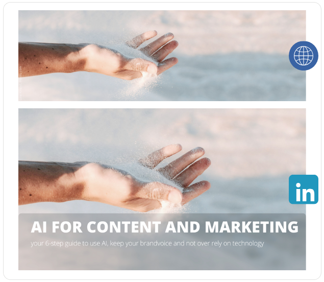
And there is no shame in adding copy to your visual. For my LinkedIn newsletter, I know that you don't read the caption or the title of the preview, so I added the hook to my visual. This is a bespoke visual, only used for the LinkedIn newsletter and a deviation of the header for the blog.
I use templates in Canva to create in less than 5 minutes all the header visuals I need: newsroom on my .com, LinkedIn newsletter, Instagram feed, Instagram story, and Medium.
Use screen dumps for videos
Please note that for the sexy videos in Instagram stories, reels, or extended LinkedIn videos, the content approval process can differ slightly from the visual plus copy content assets. In that case, it's good to include some screen dumps from the video in the content calendar.
For email marketing, the same applies
In your email, you probably have a big, bold header with some boring stock image with your logo. See the first screenshot in the visual below. Pretty boring, right?
If you focus on the visual, you'll get a much more engaging and better email. See the examples in the visual below. Here the same applies, no shame in adding copy to your visual for clear and direct communications. You can't expect your customer to make an effort and scroll down to see your message.
- first image: I have no clue what you want to tell me (I'm too lazy to read the long subject line, and my eye is drawn to the big blue header with just a logo)
- The second and third image also have their logo on top. However, it's much smaller. In the first view the copy in bold and the visual just above the fold get my visual attention
- The newsletters with a visual on the top speak for themselves. Patagonia even made an effort to let the copy ‘New Arrivals’ pop up just above the fold.

Implementing visual hierarchy: practical tips
The only thing you’ll need to do is make the visual the most important element in your content calendar, by preference in situ → the mockup post, exactly as it's seen by your customer on mobile.
That’s honestly the only way I sign off on content produced by our team.
What you can do:
- Make the visual the most important element of the post in your content calendar
- For social, create two caption sets: the short copy with the ‘read more’ for the first view and the extended copy
- For email, preview with the fold in mind. On mobile, of course
- If you have a video or LinkedIn document, use screen dumps in the content calendar
- Create templates for header visual production in less than 5 minutes
Choosing the right tools for your visual content calendar
I’m still surprised most content calendars and tools are so focused on the copy. What's going on? The visual is the main element of the (social) post, and the above-the-fold part of the email is what captures the first attention.
Maybe it’s me being so visually focused… I don't know. However, you don’t sign off on a TVC or a DOOH based on the copy, do you? Why not apply the same visual sign-off process to social and email marketing assets?
That said, I haven't found one content calendar that focuses on the visuals as the main element of the post or has a place for the mockup.
If you know visual-centric content calendar tools, please let me know.
Conclusion: my vision for the visual future
The visual is the most important element of your content distribution, as well as social and email marketing. And within shortly probably also a bigger role for Google SGE.
Currently, all content calendars I have seen are still copy-centric. WTF is going on?
It's time for a shift from copy-centric to visual-centric in the content review processes!
We should do a better job reviewing and signing off on the content and posts in exactly the same way our customers see them. Make the visual the hero of your content calendar and sign off on that as well, next to the copy.
Let's start with improving our ways of working and being more visual-centric, and the tools will follow.
Stay ahead: subscribe to my newsletter
If you want to stay up to date on AI, content, and marketing based on insight and how it matters to you, subscribe to my LinkedIn newsletter. And you'll automatically receive my monthly update on the LinkedIn algorithm in your inbox.
Two-click subscribe, and one-click to unsubscribe if you don’t like it.
Easy does it.
 Powered By PressPage